SHERLOCK HOLMES On Film: An Introduction

Discovering Mr. Holmes

When I was a wee lad, my favorite heroes were the swashbuckling ones. Zorro, the Three Musketeers, Captain Blood, the Count of Monte Cristo. I also like Batman and Superman, but my access to comics in those days was limited, so except for the occasional TV airing of one of the old Batman serials, George Reeves as Superman was my only superhero fix. This was early ’60s, and on almost any Saturday afternoon, when the morning cartoons were done, I could plunk myself down in front of our tiny black and white TV and be relatively sure of finding Errol Flynn or Tyrone Power dashing about at some sort of derring do.

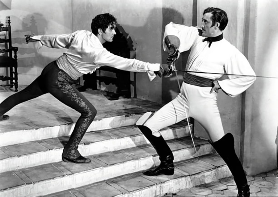
Tyrone Power vs. Basil Rathbone in The Mark of Zorro. One of my all-tome favorite film duels. Little did I know as a child that I’d eventually become even more fascinated by another of Rathbone’s roles—one for which he would become famous, and with which his name would be synonymous for a generation.

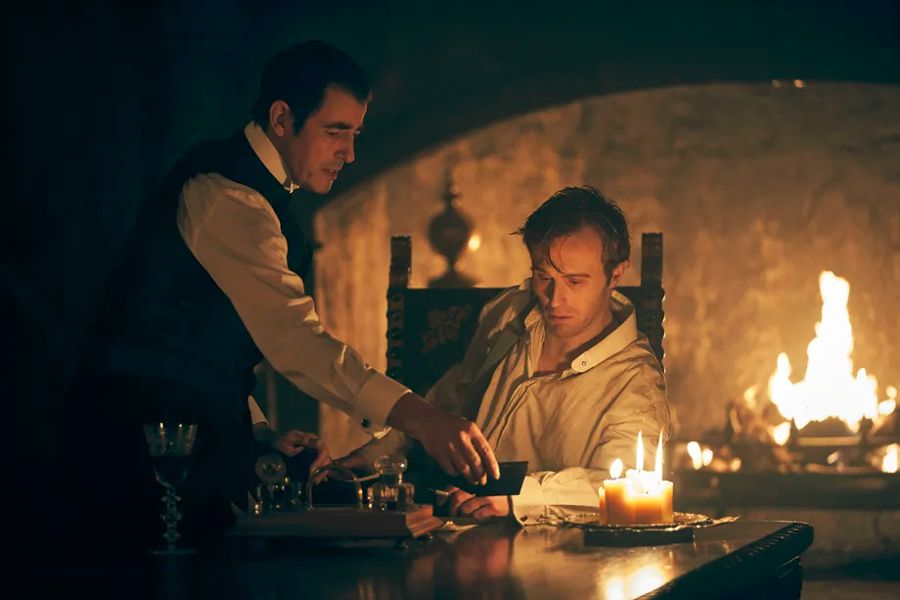
My father didn’t watch television that much. Oh, he’d watch the evening news, and maybe a bit of Ed Sullivan on Sunday night, but for the most part, he preferred reading for his entertainment. So it surprised me when one Saturday afternoon — I must have been about five or six – I was settling down to watch an Errol Flynn movie, when my father announced he wanted to change the channel, as there was a movie he wanted to see. It’s typical of my relationship with my father that even though he could have arbitrarily insisted, instead, he tried to persuade me that I’d enjoy watching this film with him. The film was The Adventures of Sherlock Holmes.

“Who’s Sherlock Holmes?” I asked, intrigued, but not really wanting to give up Errol Flynn’s swashbuckling.

“Trust me, you’ll like him,” my Dad said. “He has a cape.”

Apparently, my father had noticed that one commonality between these characters I loved was that many of them wore capes. Grudgingly, I agreed.

As it turned out, there was no cape in evidence until the very end of the movie (and then it wasn’t a proper cape, but a short-caped Inverness coat), but after the first few minutes, it hardly mattered. I was enthralled. And when it comes to Sherlock Holmes, I’ve been that way ever since.

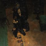
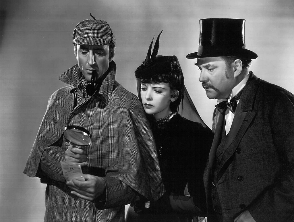
Basil Rathbone, Ida Lupino, and Nigel Bruce. Publicity shot for The Adventures of Sherlock Holmes (1939, 20th Century Fox)

Besides reading the entire Holmes canon many times, as well as many of the pastiches later writers created, I’ve seen every Holmes film and television series I could get my hands on, from Nicholas Roeg’s college age Young Sherlock Holmes to Ian MacKellan’s borderline senile version in Mr. Holmes, from the silent films of Ellie Norwood to the latest Robert Downey films, from Sheldon Reynolds’ 1950s TV series with Ronald Howard, to Grenada TV’s shows with Jeremy Brett, and CBS’ Elementary with Jonny Lee Miller.

When I conceived the idea of writing about Holmes films, it seemed a little daunting to just jump in at the deep end. With the possible exception of Dracula, Holmes has appeared in more films than any other literary character, so the field is a huge one. Even brief write-ups on every film would be a herculean task. Where to even start? With the ones I thought were best? With the most popular? The most canonical?

I decided to start with the canonical films – those that were actually based on Doyle’s original stories. That limited the field considerably. Since there have been a good number of television series over the years which took on the short stories, to limit it even further, I decided to take on only feature length films (this will include television series dramatizations that run to feature length, as well as made for TV movies).

(I’ll also reserve the right to now and then depart from the series to ramble on about other random Sherlock Holmes films, as the whim takes me. As Chuck Wendig might say, shut up, it’s my blog, dammit.)

So I’ll begin this series with a consideration of the films based on The Sign of Four.

“A Singular Case”

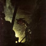
Making films based on Arthur Conan Doyle’s Sherlock Holmes tales is a challenge. Most of the Holmes tales are short stories, which would need considerable padding to extend them to feature length. Of the four novels, three have extensive flashbacks revealing the history of the case, in which Holmes plays no part, and the fourth, The Hound of the Baskervilles, has Holmes offstage for a long period.  Most canonical films settle on either The Sign of Four, or the Hound of the Baskervilles. Sign has the shortest of the three flashbacks, and Hound contains elements which could appeal to horror film fans as well as mystery buffs.

The Hound of the Baskervilles is the best known, and more often filmed; there are over twenty film versions of Hound, while The Sign of Four boasts less than a dozen (A Study in Scarlet and The Valley of Fear have each been done once, but the former, made in 1933 with portly Reginald Owen as Holmes, has little to do with the book except for the title, and the latter, made in 1916 starring H.A. Saintsbury, is lost). While Hound  might appeal to both mystery and horror buff, it nevertheless presents problems of its own. Although unlike the other three novels there is no long flashback, Holmes remains offstage through much of the book — if you’re relying on a famous character to draw your audience, it’s a bit counter intuitive to have that character disappear for large swathes of screen time.  And while the tors and marshes of Dartmoor may be very atmospheric, they are not the foggy gaslit streets with which Conan Doyle’s creation is mostly associated. For a feature film which presents the most classic and archetypal version of a Sherlock Holmes tale, The Sign of Four has got to be the pre-eminent choice.

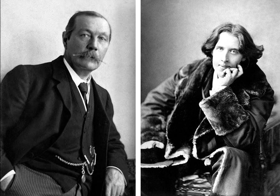
Literary giants met over dinner:  Sir Arthur Conan Doyle (L), Oscar Wilde (R)

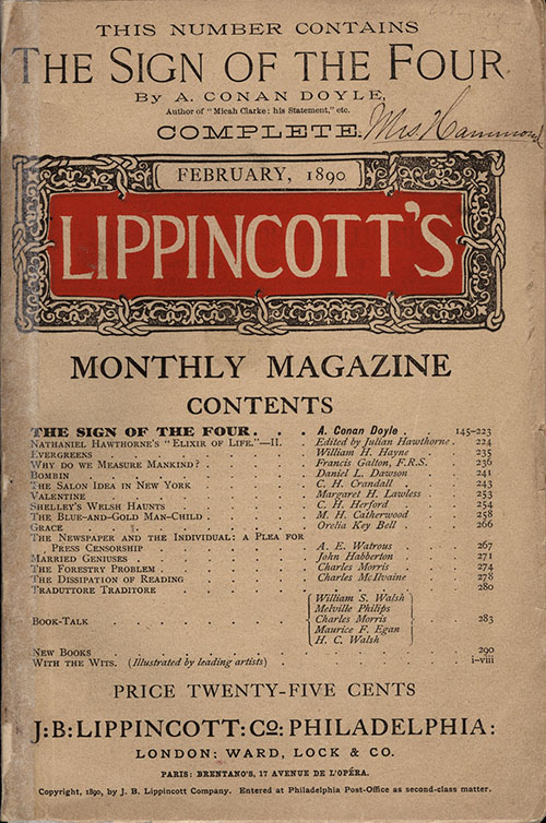
In 1889, Arthur Conan Doyle was at a dinner at the Langham Hotel with Oscar Wilde and Irish MP Thomas Gill, hosted by Joseph Stoddart, the editor of the American Lippencott’s Magazine.  Stoddart wanted to start a British edition of Lippincott’s, and proposed to commission works from both Doyle and Wilde. The result was the publication in Lippincott’s Magazine of Wilde’s The Picture of Dorian Gray, and Doyle’s The Sign of Four.

Doyle would later write of that evening at the Langham “It was indeed a golden evening for me.” and of Wilde, “His conversation left an indelible impression upon my mind.” (Doyle, Memories and Adventures, Chapter 8). That impression clearly influenced Doyle’s creation of the character of Thaddeus Sholto in The Sign of Four. Sholto, like Wilde, is clearly an aesthete, describing his sumptuous orientalist apartment as “An oasis of art in the howling desert of South London.” Doyle also describes Sholto in terms that could easily have described Wilde: “Nature had given him a pendulous lip, and a too visible line of yellow and irregular teeth, which he strove feebly to conceal by constantly passing his hand over the lower part of his face.” (Doyle, The Sign of Four, Chapter 4)

Published by Lippincotts as a serial titled The Sign of the Four; or The Problem of the Sholtos, on subsequent publication as a book, the second “the” was dropped, along with the subtitle.

We’ll begin next time by taking a look at two of the earliest film versions of Sign.

Next: The Early Films: Silents and Black and White


Posted in Movies & TV, Sherlock Holmes, Uncategorized | Leave a comment

Dracula gets the Sherlock treatment

Gatiss & Moffat promised they were NOT going to do an updated modern version of Dracula, like they did with Sherlock. They lied. Within a few episodes, we’re in today’s world.

Spoilers ahead.

The opening was very promising. They were ringing some original changes on Stoker’s novel, and there are some interesting ideas, but in the end, it turns into a hot mess. Gatiss & Moffat as usual are so busy showing off how clever they are that they lose sight of their story, and it becomes all flash and little substance. And Moffat’s usual misogyny and inability to follow through on big setups is on full display here.

It’s not like there’s nothing to like in this film. It’s a high quality production, and the actors are generally excellent.  Though it’s a new and different take on the Dracula story, it’s also replete with visual references to earlier versions. At various points, Claes Bang as Count Dracula is dressed like Bela Lugosi, complete with the ribboned medal Lugosi wore with his white tie and tails, and later in Sir Christopher Lee’s black suit and cape. In the opening scenes, although he doesn’t have the elaborate hairdo, he strongly resembles Gary Oldman’s old Dracula, and in many later scenes, Bang’s appearance and performance is reminiscent  of Louis Jourdan’s earlier BBC outing in one of the most authentic versions of Stoker’s tale.  The location shots of Dracula’s castle are at Orava Castlein Slovakia, which played the same role in 1922’s Nosferatu.  Many interiors were shot at Bray Studios, home to Chris Lee’s Hammer Dracula films of the ’60s and ’70s.  About the only major Dracula film I didn’t notice a visual shout-out to was Langella’s uber-camp version, based on his successful Broadway play. Which is odd, since they’re indulging in a lot of camp themselves.

Claes Bang dressed like Lugosi

Claes Bang’s Dracula in Bela Lugosi drag (BBC/Netflix)

But the series doesn’t quite know if it wants to be a serious vampire story or a comedy. Even in the period scenes, Dracula’s lines are full of puns and jokes. Be that as it may, much of the period material is reasonably solid. With the first two hours devoted to the opening of Stoker’s novel, from Harker’s (John Heffernan) ordeal in Transylvania to Dracula’s voyage to England on the Demeter, we’re led to expect a long and in-depth revision of the novel, probably extending to eight or so episodes. However, it all collapses into farce in the third concluding episode.

The third episode brings Dracula to England in the modern world, and it’s a pathetic mess with only the occasional bright spot. Dracula’s played as the usual time traveling fish out of water, and it’s in this final episode that the female characters really get short shrift. They’ve already dismissed Mina Harker (Morfydd Clark), the heart and soul and real hero of Stoker’s novel, as a screaming flibbertygibbet victim, and now their female version of Van Helsing (Dolly Wells) is surprisingly ineffective despite her spunky “strong woman” dialogue. Lucy Westenra (Lydia West) gets portrayed as a shallow, selfish narcissist who fully deserves her hideous fate. And Dracula, who despite his James Bond quips and jolly demeanor has been portrayed throughout as the ultimate monster, becomes a self-sacrificing hero at the end, a conversion that’s in no way earned by previous character development.

Claes Bang and Dolly Wells

Claes Bang as Dracula and Dolly Wells as Zoe Van Helsing. This final confrontation is a callback to that of Hammer’s Dracula, where Cushing’s Van Helsing and Lee’s Dracula face off over a long refectory able, and Van Helsing ends up pulling down the curtains to let in the sunlight. (BBC/Netflix)

If they’d continued as they started, going for eight or so episodes and playing out the rest of the novel to the extent and at the pace they played out the opening, even with the shift to modern times, this could have been the definitive Dracula for this generation. Instead, they squandered that whole extended setup on a quick breeze though a modern version of the Lucy scenario, with a couple of tropes culled from the later (and worst) Hammer/Lee Draculas and Wes Craven’s Dracula 2000, with a bunch of self-indulgent “aren’t we clever” moments tossed in.

Dracula and guest

Dracula (Claes Bang) and Harker (John Heffernan) (BBC/Netflix)

We begin with Jonathan Harker’s ordeal, which to a large extent, mirrors his ordeal in the book, though with considerable elaborations and variations. Much of the sense of this section of the series is true to what Stoker created. By the end of the first episode, however, we’ve left Stoker far behind, with Dracula attacking the convent in which Jonathan Harker is recuperating after escaping the castle. Harker himself has now become some sort of vampire, or at least some form of undead. And Van Helsing has already shown up, as a nun in the convent, questioning Harker about his ordeal. She seems to know all about Dracula already, and realizes he’s not just your average vampire.

Dolly Wells as Agatha Van Helsing

Dolly Wells as Agatha Van Helsing (BBC?Netflix)

I have less issue with changing Van Helsing’s gender than with making her already an expert on vampires in general, and Dracula in particular. Stoker’s Helsing is not a vampire hunter to begin with – he’s a doctor who specializes in diseases of the blood, and he comes to the conclusion that Lucy has fallen victim to a vampire only reluctantly, after he’s eliminated other possibilities. He has to go off and study up on vampirism in order to deal with it, and when he puts together that the vampire is Dracula, has to consult with a professor from Budapest to find out who Dracula was/is. Making Van Helsing a pre-existing expert vampire hunter is one of the annoying tropes I’ve hated about a lot of Dracula adaptations, because it changes the whole dynamic of the story. In Stoker’s novel, we have a couple of modern scientists (Seward and Van Helsing) who are reluctantly grappling with the sudden appearance in their logical, rational world of an ancient supernatural evil. Stoker’s book is awash in what was at the time modernity – bleeding edge technology like typewriters, bicycles, gramophones, telegraph, telephone, social change and the “modern woman.” Our heroes defeat Dracula partly by their use of science and modern technology, things Dracula has little understanding of. They piece things together from newspaper articles and official reports, and leverage the paper trail Dracula does not realize he’s leaving – bills of lading, shipping records, schedules.

Here, exactly the reverse becomes true. Thrust into the modern world, although he starts out clueless and confused, Dracula quickly adapts, and it’s his opponents who are wrong-footed as he skypes with his lawyer, and draws his victims by texting them.

Admittedly, by the end of the second episode, I was feeling like they’d have been better off setting this whole story in more contemporary times after all. The aesthetic they were going for, and the dramatic dynamics would have worked better in modern times than in the Victorian period. Little did I know they were about to bring it into today’s world. Unfortunately, despite some interesting twists, it doesn’t really work, and Moffat’s famous misogyny is on full display, despite the attempt to make the Van Helsing women (Agatha in Victorian times, Zoe in modern day, both played by Wells) the heroes of the tale.

Dracula’s voyage to England on the Demeter is considerably expanded on. In the novel, there is no mention of passengers, the Count traveling secretly, his body ensconced in the “boxes of earth” being shipped to England. Here. there are a number of high society passengers, among whom Dracula moves and socializes.

The confrontations on the Demeter become the pivotal moment in the revised story Gatiss & Moffat are telling.

And, bang, in the next episode, we’re in modern times.

This could have been an exciting updating of Stoker’s novel. Instead, we got a solid beginning that devolved into a self-indulgent mess, with Gatiss and Moffat congratulating themselves on how fucking clever they are.  The unfortunate tendencies that ruined Sherlock also ruined their Dracula, which is a shame, because like Sherlock, it started with great promise, but ultimately failed because they were too seduced by their own cleverness.

Posted in Dracula, Horror, Movies & TV | Leave a comment

House of Long Shadows

This was the last film that Peter Cushing and Christopher Lee appeared in together, so of course I had to check it out. I’ve never seen or read Seven Keys to Baldpate, the George Cohan play this movie is based on (nor have I read the Earl Derr Biggers novel the play was based on), so I have no idea how faithful it is to the source material, but it’s a mildly amusing horror comedy. A writer (Desi Arnez Jr. as Kenneth Magee) makes a bet with his publisher (Richard Todd as Sam Allyson) that he can write and old style gothic novel in 24 hours. In order to do so, he’s going to spend the night in Baldpate Manor, an old house in Wales that’s supposedly cursed, and has been empty for 40 years. But as he’s attempting to work, one strange character after another shows up to interrupt him, each apparently having a key to the house (hence, the original title).

The premise, as stated, is ridiculous, of course. In the original play (according to Wikipedia) the bet is for the writer to create a 10,000 word novella. This seems like an achievable goal, though the result would be a very rough first draft, not a finished novella. But a full novel in 24 hours? Even in the ’70s, when the movie was made, and when novels were generally shorter (an average of 60,000 to 70,000 words, and even assuming the writer was one of those pulp writers from the ’30s and ’40s, who cranked out a novel in a few days, a full novel in a single night seems like the first joke in this comedy.

The second joke is the cast. They seem to have hauled in every famous male horror star they could to play the various weird folks who turn up to prevent the Arnez/Magee from completing his manuscript: John Carradine, Peter Cushing, Vincent Price, Christopher Lee. Unfortunately, the great cast is not well used. The scares never really scare, and the comedy never really becomes all that funny.

And why is the front of a manor house with no electricity apparently lit by floodlights?

At the end, there’s and O. Henry twist (or a Night Shamalyan twist), followed hard by a second twist.

(Warning:  here be spoilers)

The first to show up are Carradine and Shiela Keith, pretending to be the caretakers, but who are actually the original owner, Lord Grisbane, and his daughter Victoria. Next comes Magee’s editor’s secretary, Mary Norton (Julie Peasgood), at first pretending to be a secret agent warning Magee against a threat on his life. Then there’s two more men who show up (Cushing, and Price), who turn out to be Lord Grisbane’s sons. It’s a family reunion in the manor before it gets sold off. Christopher Lee shows up as Corrigan, who claims he’s bought the mansion, intending to raze it and sell the land off for development. He grudgingly assents to the Grisbane’s pleas to allow them to have their reunion, but why he should remain for the night is unclear, and makes little sense. Finally, a pair of young newlyweds who’ve gotten lost show up seeking shelter from the storm.

It quickly becomes evident that there was a family tragedy and scandal which split he family up, sending them all away to the ends of the earth. The missing brother, Roderick, was responsible. But wait, it then develops that brother Roderick Grisbane is supposed to have been locked in his room for 40 years? How is he supposed to have survived? Eating wallpaper paste and drinking rainwater? Turns out Victoria has been bringing him food the whole time. But the room Roderick was imprisoned in turns out to be empty. And the Grisbanes start getting killed off one by one. Lee/Corrigan turns out to be Roderick Grisbane, the black sheep brother who caused the family’s downfall, though it’s not clear why none of the other Grisbanes recognize him.

Except of course, in the end, the whole thing turns out to be a put-up job. The Grisbanes (and the young couple who arrive seeking shelter from the storm and get murdered) are all actors, hired by the publisher to disrupt Magee’s writing process, and teach him a lesson. In the aftermath, they all gather to drink champagne, and there’s this little exchange between Magee and his publisher:

Magee: “You really are a bastard, you know.”
Allysoon: “Well, I’m a publisher. What did you expect?”

But then, wait – now the second twist comes in. None of this actually happened, it’s all the story of the novel Magee has spent the night writing. I have to assume they went for this second twist because if you were paying attention, the first one is actually pretty obvious.

Posted in Uncategorized | Leave a comment

On Satire

Political cartoon by Michael de Adder

Cartoon by Michael de Adder

One of the trends I’ve been watching the past few months is the decline of mainstream media’s support for political cartooning and satire.

If satire is doomed, or society is doomed.

It just so happened I came across a bunch of different articles in the same day that seemed to me to coalesce into a dark picture of one aspect of what’s happening in our society. A newspaper cartoonist in Canada got fired for doing a cartoon critical of Trump, another in Pittsburgh suffered the same fate. First Look Media will no longer support the comics site The Nib, The New York Times announced it will no longer publish political cartoons, and ATT/Warner/DC cancelled Mad Magazine.  More recently, a political cartoonist for the Farm News was fired for being critical of large farming corporations.

Admittedly, satire has been becoming harder to do all the time. Half the time, headlines from the Times or the Post sound like they were written for The Onion. At the same time, doing satire has become increasingly dangerous. You can lose your job, or extreme cases, even get assassinated, for satirizing the wrong person or subject.

Although the Brunswick Times claims cartoonist de Adders’ Trump cartoon was not the reason they fired him, he says he was told Trump was “a taboo subject.” The Pittsburgh Post-Gazette claims they fired cartoonist Robert Rogers because he “wouldn’t be edited,” which Rogers says means he refused to do cartoons promoting Trump. The Times doesn’t explain its decision to quit publishing political cartoons. Warner/DC claims Mad isn’t profitable any more, and First Media gives the same excuse for cutting the Nib loose.

Maybe it’s true that Mad or the Nib weren’t profitable, though most journalists covering these stories have suggested that “not profitable” in both cases doesn’t mean they weren’t making money, just that they weren’t making the enormous profits that the company’s other publications were.

But editorial and political cartoons’ primary worth isn’t the profit they generate, but what they bring to the public discourse. As The Nib’s contributing editor Sarah Mirk told Longreads, editorial cartooning is “not something where you get a high financial reward on your investment — what you get back is cultural change. For people who just care about money, maybe they shouldn’t be funding journalism.”

It looks to me like both the Times and DC are acting the way most of big media – or at least big print media – is acting, caving to the culture of never giving anyone offense and never calling out those in power. They are simply too cowardly to continue giving a voice to satire.

But even if I’m wrong about their motivations, these are still bad moves for our cultural health. If, both as individuals, and as a society and a culture, we can’t laugh at ourselves, our leaders, our institutions, our human foibles and stupidities, we’re in deep trouble.

Thankfully, SNL hasn’t been cancelled yet, and both Trevor Noah and Stephen Colbert look to be pretty secure in their jobs. Print media could take a clue from some television media, and grow some friggin’ balls.

Humor and satire can cut through the bullshit, down to the bone and the core of the issue. Naturally, some folks don’t care for that. As Nanny Ogg says in one of Terry Pratchett’s Discworld stories, “When people say things are a lot more complicated than that, they means they’re getting worried that they won’t like the truth.”

Posted in Art, Uncategorized | Leave a comment

Authorial Intent

I liked Lindsay Ellis’ video on “Death of the Author,” and John Scalzi’s blog post on the subject, and it reminded me of a story. Check ’em both out, I’ll be here when you get back.

Lindsay Ellis: Death of the Author

John Scalzi:  Death of the Author… Maybe

Back? Good, okay, here’s the story…

Years ago, I was hired to paint a cover for Fred Saberhagen’s omnibus The Complete Book of Swords. The publisher gave me the manuscript to read, I read it, and the Art Director and I agreed that the cover should depict the “one sword to rule them all,” as it were. Problem was, though this was a super-special sword made of unobtanium (or whatever, I forget the term), Fred had never actually described the thing.

So I called the A.D. up and said “I want to be sure and get this right, but I have questions about how this sword looks that aren’t answered by the text. Can you put me in touch with the author, so I can ask him about it?” The A.D. sez “Absolutely not! We have a strict rule about that, no contact between author and cover artist.” Hunh.

Okay. Well, it’s not as if I didn’t know a few people in the field, so through mutual friends, I managed to get a message to Fred (this was in the days before email). He responded with his phone number, and an invitation to call. So I called him. We had a nice chat about various aspects of the book, and writing and publishing generally (the guy was a prince, very gracious, full of interesting stories). Eventually, I got around to asking about the details of this sword.

And Fred goes, “Gee, I dunno, I never thought much about that. What did you think it should look like?”

(Yeah, if you went to the links above, you saw that coming, right?)

He liked my ideas. So I painted the cover. Art Director loved it. Fred called me up to say he loved it. I got paid. But much as they loved it (and kept reissuing it with the same cover for years), that publisher never gave me another assignment. Made me wonder if they’d found out about my end run around their “no contact” rule.

Coda:   Years later, after Fred had passed, his executor got in touch with me to say that it was one of Fred’s all-time favorite covers, and to enquire how much I would charge to allow them to use it on the memorial website they were doing for Fred.

I told him they were welcome to use it for free, all I wanted was credit.

Posted in Uncategorized | Leave a comment

The Frankenstein Chronicles

The Frankenstein Chronicles is often described as a retelling of Mary Shelley’s Frankenstein but it’s not that at all. Set a few years after the publication of Shelley’s book, it’s the tale of detective John Marlett (Sean Bean), a Bow Street Runner (predecessors of the Metropolitan Police), investigating the case of a body washed up from the Thames which appears to be a failed attempt to replicate Frankenstein’s experiments – a body sewn together from several corpses. Though it at first this seems to be more or less a straight mystery, before the end of the first season, it has devolved into a horror story that delves into the same questions and issues as the book for which it is named; questions about the nature of god, life, and what constitutes humanity.

Overall, I thought The Frankenstein Chronicles was quite good.  The production values are excellent, the period well portrayed. I admit, I wondered about the inclusion of a black man among the Bow Street Runners, but a little research proved this was entirely possible.  Kudos to the writers and director for giving Constable Joseph Nightingale a fully fleshed out character that actor Richie Campbell could sink his teeth into, complete with his own story arc.  And for not flinching at portraying the sort of racism such a character would encounter.

Richie Campbell as Constable Joseph Nightingale in The Frankenstein Chronicles

Richie Campbell as Constable Joseph Nightingale (Rainmark Films)

Where the series does stretch it a bit is the compulsive inclusion of famous people from the period. There’s Mary Shelley, of course, and husband Percy, as well as Frederick Dipple (arguably the original model for Victor Frankenstein), but there’s also Sir Robert Peel, Charles Dickens, William Blake, and Ada Lovelace, and probably a couple I’m forgetting. Some were indispensable, given the premise of the show, but others seemed shoehorned in just for a name check. At least Dickens goes by “Boz” through most of the series, so if you didn’t know his pen name, he’d be just another young journalist.

Sean Bean as detective John Marlett in Rainmark Films' The Frankenstein Chronicles

Sean Bean as John Marlett (Rainmark Films)

It must be said, Bean’s character does several times makes frankly stupid mistakes that no streetwise cop would make, even in 1827. Marlett is no Sherlock Holmes, or even Sergeant Cuff – he’s overly emotional, exploding when he ought to be restrained, close mouthed when he ought to be communicative, behavior that might be acceptable in your average Joe, but which rings a bit false in a character who is supposed to be, if not brilliant, at least canny and crafty.  By the second (final) season, Marlett has become more victim than avenger, and when he wins out, it’s more by luck than craft.

Yet that’s also one of the endearing qualities of the series. There are no superheroes or supervillains here, just deeply flawed human beings, stumbling and bumbling along, protagonist and antagonist alike, relying as much on luck as skill. And it’s 1827 – things often don’t work (Marlett’s pistol falls apart at inopportune moments, for instance), medical science is in its infancy, forensics basically doesn’t exist, and everyone’s flying by the seat of their pants.

All in all, it’s an entertaining series, with terrific production values, some excellent acting, and decent, if occasionally flawed writing.

Posted in Movies & TV, Science Fiction & Fantasy, Steampunk | Leave a comment

Bernie Wrightson: Elegant Lines

Bernie Wrightson (1948-2017) was an illustrator and comic book artist whose pen and ink style was quite unique.

Frankenstein pen and ink illustration by Bernie Wrightson. Victor Frankenstein seeks parts for his creation in a tomb.

Victor Frankenstein shopping for parts – Bernie Wrightson

Wrightson began his career as an illustrator for the Baltimore Sun, but within a couple of years went to work for DC Comics, mostly working in horror comics like House of Mystery and later Marvel books like Chamber of Darkness and Tower of Shadows. Working with writer Marv Wolfman, he co-created Destiny, a character who would later appear as one of the Endless in Neil Gaiman’s Sandman. His greatest impact on comics, however, was probably the creation of the Swamp Thing with Len Wein. In the 70s, Wrightson went to work for Warren Publications, whose larger format black and white horror comics were a more appropriate venue for his elaborate ink style than color comics had been.

Pen and ink drawing by Bernie Wrightson depicting Frankenstein and his creation in the lab

Frankenstein’s creature confronts him in his laboratory. Bernie Wrightson (Click to enlarge)

Wrightson’s real masterwork, however, came in 1983 with the publication of his illustrated edition of Mary Shelly’s Frankenstein. It was a labor of love on which the artist had spent seven years producing 50 gorgeous large scale pen and ink dawings (some of which I’m including here). Frankenstein was a perfect match of style and subject, as Wrightson’s intricate inking style mimics the appearance of the steel and wood engravings used in publications of the period. Wrightson clearly drew inspiration from golden age illustrator Franklin Booth (1874-1948).

Illustration in pen and ink by Franklin Booth.

Franklin Booth

As a young man, Booth, according to legend, did not realize the pictures he was copying were engravings, and taught himself to laboriously copy their style in ink. (For those who aren’t familiar with the process, the original artists for publications back in the day usually did tonal drawings, which would then be turned over to engravers, who reproduced those tones by the use of parallel and hatched lines, engraved backwards directly onto a metal printing plate).

Below, a sampling of illustrations from Wrightson’s Frankenstein (Click to enlarge):

Wrightson’s illustrated Frankenstein includes an introduction by Stephen King and from Wrightson himself. The illustrations themselves are not based upon the Boris Karloff or Lee films, but on the actual book’s descriptions of characters and objects. For the 25th anniversary of the first edition in October 2008, a new edition was prepared and released by Dark Horse Comics in an oversized (9″ x 12″), hardcover format, scanned from the original artwork, when it could be tracked down.

Wrightson was also a fine painter, though his paintings were far rarer than his ink work. In 1976, he produced a portfolio of paintings illustrating Edgar Allan Poe stories.

In later years, he would work with Stephen King, illustrating Creepshow, Cycle of the Werewolf, The Stand, and Wolves of the Calla. He contributed concept art to the movies Ghostbusters, Galaxy Quest, Spiderman, George Romero’s Land of the Dead, Frank Darabont’s Stephen King film The Mist, and to Joss Whedon’s Serenity, for which he designed the Reavers.

Amazon has Wrightson’s illustrated Frankenstein in two editions:

The 2011 Dark Horse Edition  and the 2020  Gallery 13 Edition.

Posted in Art, Books, Illustrators | Leave a comment

The Emperor’s New Spam

Recently, I’ve been getting spam – the Chinese equivalent of the famous Nigerian bank scam, where someone has left me a gazillion dollars, and all I have to do to receive it is give the scammers access to my bank account.  These emails come from someone named “Hong Wu”.  The name seemed to ring a bell somewhere in the back of my brain, and after I’d received several of them, I heard a voice in my head saying “Marks of the Hong Wu?  That is a vexed question.”

Ah, yes, then I remembered… that was Edward Hardwicke’s voice, from the Granada Sherlock Holmes episode “The Illustrious Clent”, wherein Holmes (Jeremy Brett) sends Watson (Hardwicke) disguised as a collector of rare Chinese pottery to draw the villain, Baron Gruner (Anthony Valentine), away from his study, while Holmes searches it for evidence.  Thanks to the client of the title, Holmes has sent Watson along with an actual piece of Ming pottery to intrigue the villain.  In the film, the Baron becomes suspicious, and questions Watson on several obscure points about pottery. Watson’s done some boning up, of course, but  couple of days of study does not a true expert make.  Still, he’s doing pretty well, holding his own, until the Baron asks his opinion about “the marks of the Hong Wu.”  When Watson, confused by this, temporizes, calling it a “vexed question,” Gruner replies, “I should think so.  There are no marks on the Hong Wu,” and Watson’s imposture is discovered.

Watson (Edward Hardwicke) and Baron Gruner (Anthony Valentine).

“Marks of the Hung Wu? that’s a vexed question.”

Curious now, I checked Wikipedia to discover that Hong Wu (aka Hungwu, given name Zhu Yuanzhang, 1368–1398) was the founder and first emperor of the Ming Dynasty of China. His era name, Hongwu, means “great military power”.

Zhu Yuanzhang, aka Hongwu (1328 – 1398). Painting in the National Palace Museum, Taiwan.

Why a long dead Chinese emperor would need to run the modern equivalent of the old Spanish Prisoner con is, paraphrasing Watson, a vexed question.  I suppose the Communists have probably confiscated whatever monies he had stashed away all those years ago.  I hate to tell him he made a bad choice sending his email to me – even if I weren’t wise to the con, there’s hardly enough money in my bank account these days to make it worth his pilfering it.

Sorry, Hong Wu, better luck next time…

Posted in Uncategorized | Leave a comment

Fire Aloft Cover Reveal

The collaborative steampunk novel Fire Aloft, written with my old friend (and editor on Darkwalker) Rev DiCerto, is now available for pre-order. Here’s the cover:

And here’s a larger version of just the illustration:

Fire Aloft is what I’d call “hard” steampunk – there are no sorcerers, werewolves, zombies or vampires (sparkly or otherwise), just technological advances based, so far as we could, on real science. And air pirates.  After all, what’s a steampunk tale without air pirates?

Posted in Uncategorized | Leave a comment

The Paper vs Pixel Debate

Recently, someone pointed out this article to me:

E-Book Sales Slip, and Print Is Far From Dead

It’s a longish article, and if you can’t be bothered to read the whole thing, the headline gives you the gist.  And it kicked up a lot of heated debate on social media between the advocates of ebooks and those who cling to real paper books.

Me, I’m what they call a hybrid reader, a fan of both ebooks and paper, so I don’t have a horse in this race.  But what this article misses is that outside of the Big 5, the AAP’s 1,200 publishers are mostly the Big 5’s many imprints, along with textbook publishers and university presses (both of which are more heavily print-oriented).  And it barely acknowledges that the Big 5 have been inhibiting their own ebook sales with their artificially inflated prices.  Ebook sales are not declining – the ones that have gone missing from AAP’s report have migrated to buying from small, indie, and self-publishers that AAP doesn’t track.  From all the reports I’ve seen, those publishers are still seeing a steady increase in their sales.

Of course, the article condescendingly admits that the sales may have moved to “cheap and plentiful self-published e-books,” a snotty, perjorative phrase that unfairly condemns a whole class of creators.  That some inexpensive ebooks are just crap goes without saying – but so are many paper books.  Sturgeon’s Law exempts no medium.  Which sounds discouraging, until you consider that along with condemning the vast majority to the dung heap, it also suggests that you will always find ten percent at the top of the heap that’s brilliant stuff, pure gold, no matter what venue, genre, or medium you look into.

Digital or traditional, it’s all the same to me.  I love getting my hands in actual paint, and I also love using my Wacom and painting with pixels.  It’s not about the medium, it’s about the content.  All art is essentially a form of communication, and what you have to say is far more important than what tools you use to say it.  To my mind, anything that lets you make a mark, define a form, write a message, is a valid medium, whether it’s a burnt stick against a cave wall, or a chisel on a wax tablet, a quill pen or a keyboard, a bristle brush against canvas, or your finger directing effing pixels projected in the air.

When we get into debates about ebooks vs paper, or photoshop vs oil paints, we’re missing the point.  As creative artists, we’re stepping further away from each other over the less significant aspect of what we do – the media we use – and missing the connection we should be making over the more important aspects – what we do with it.  Chevy or Ford, Mac or PC, practical or CGI, pen or keyboard, if you can make it work for you, who cares?  All that stuff is irrelevant next to where are you going, what are you writing or creating?  Does it move the reader or viewer?  Does it engage them, and provoke a deep response?

McLuhan was wrong – the medium isn’t the message.  The medium may influence and condition the message – but only so far as the creator allows it to.  In the end, content trumps form.

I think real paper books and oil paintings both will always find an audience, even if that audience is smaller than it was in previous times.  They can’t be “killed” by ebooks or digital art, any more than radio was killed by TV, or painting killed by photography, or oral storytelling killed by writing.  All those mediums of expression survive today, and manage to thrive, even though they are no longer the primary medium they once were, and they thrive on a smaller scale.

If ebooks come to rule the market that mass market that paperbacks once owned, as seems likely, the “threat” in that is not to the existence of paper books, or even (despite the suits and bean counters’ fears) to the bottom line of the big corporate publishers. The only real threat is to the big corporation’s business model.

It’s my theory that when the dust settles, we’ll find that while ebooks may eventually replace paperbacks, as paper books become more rare and specialized, we’ll also see a resurgence things like the illustrated books made famous by Wyeth and Pyle and the golden age illustrators.  When content is downloadable at a click, the value in a paper book shifts from being primarily the value in the content, to it’s value as an object, as a physical thing you can feel and smell and, well, taste, I suppose (okay, I guess, if licking books is your thing, who am I to judge?)  Publishers of paper books, in order to stay competitive, will have to leverage that thing-ness, that physicality.  Some may try including scratch n’ sniff panels, or holograms, but those would be passing fads.  The logical thing is to produce well crafted, beautiful objects with quality bindings, great illustrations, artistic type design.

Of course, I could be wrong, and history would suggest that I probably am.  Most people who’ve had the stones  to make any sort of prediction about this kind of stuff have eventually been proven wrong, why should I be the exception?

Posted in Art, Books, Uncategorized, Writing | Leave a comment